I’ve been told that, barring last-minute surprises, the proof copy of the book will be shipped to us today. It should arrive tomorrow. Assuming we approve, we should be able to begin shipping copies shortly.
I thought it might be fun to show some of the book cover designs we considered. Can you guess which design we used? Answer tomorrow.
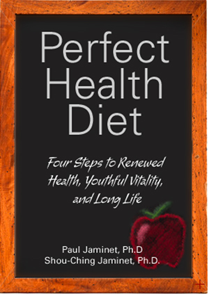
(A)
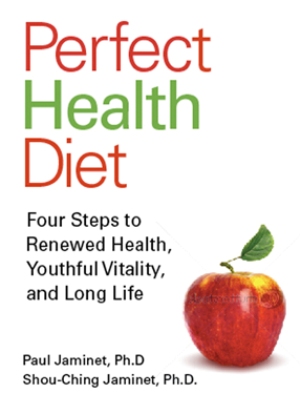
(B)
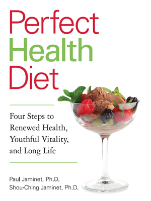
(C)
(D)
By the way, if any of you are looking for a graphic designer, we strongly recommend Monika Chas, who designed our book cover and logo. Thanks Monika!






Don’t know which you chose, but I like the lettuce one 😉
The slate.
I don’t think you used the first, because it looks kind of scholastic. Your book is geared to all people rather than just children.
I don’t think you used the second, because you have a bias against fruits which are high in fructose or carbohydrate content. The picture contains a apple, and apples are the few fruits which contain a high ratio of fructose to glucose, besides the high carbohydrate content itself. Of course, the apple in the picture is dull and boring because it’s common for health books to picture an apple.
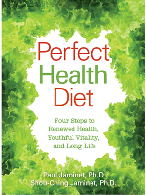
I don’t think you used the fourth, because the look of the book makes people think that your diet is based on leaves and that you value leaves as essential to a healthy diet. Of course you don’t value leaves as essential; you value fats and ruminant protein more.
So I’d have to go with the third. You value longevity over strength and robustness because I have seen that you have linked to anti-aging websites in the links section of this blog. And a wine bottle is a symbol for longevity due to its association with the so-called “French paradox.” In addition, your subtitle of your book includes the words “long life.” So I must say that you chose the third one because it matches your apparent preferences.
I’m not particularly low-carb or anti-fructose. I eat 200 grams of starch or glucose every day. And I eat up to 100 grams of fructose from sweet potatoes, fruits, fruit juice, and white sugar. So it would be surprising if I got the answer correct even though I have different beliefs.
I like the ice cream.
based on what i have read here and the current ying yang apple logo, i have to go with B.
I liked the steak and baked potato cover, but that didn’t make the cut. 🙂
I like your “yin/yang” logo very much, but it looks like it didn’t make the cut. Another vote for the ice cream.
Hi Art,
We like the logo too, but we use it a lot — it’s on the back cover, title page, and the top of every page surrounding the page numbers. We wanted something different for the cover.
I said the third option, option C, because you like fancy stuff and the wine bottle is fancy. Oh, you have a logo of an apple with the ying yang sign but I still go with the wine bottle. I have no cure what the commenters are talking about before I have seen your logo.
People are selfish, and they want fancy and expensive stuff to impress others and to make them envious. In this case, it’s the wine bottle with the berries, nuts and meat there.
Hi Luming – Yes, we do like fancy stuff. The things in the wine glass are ice cream, berries, and grapes. I can tell you that the last thing in our minds was to appeal to envy or selfishness. Now gluttony, there’s a sin we would be happy for our cover to provoke.
i like the last one 🙂
I picked the slate because it hearkens back to simpler times before processed foods and because it reminds me of the covers of those “XXXX for Dummies” books” that explained complicated things to non-experts — not an easy feat, but one which Paul & Shou Ching seem to be able to pull off with panache.
I think its C for the same reasons Luming said in the first post. Hoping its not D. You are about a lot more than lettuce (vegetarian). 🙂
Any way to purchase lots of copies of your book for a discount? i want to hand them out to all my employees, friends, and family. This book is the best I have read on a truly healthy diet.
As an employer that pays for health insurance, its time to move some of the responsibility of being healthy to my employees. But they need healthy plan to follow. And they need to understand why. Yours is as good as they come.
Jay – Yes, we’re going to have a discount for bulk sales. I’ll discuss that and other business matters in tomorrow’s post.
I like B. Not a huge fan of the lettuce one.
I’m guessing C as well.
Hmmm…of course I know which one it is! I like the comments so far! 🙂
i actually think A is pretty cool. it’s different.
I love A, very cool. Jayne
C
I’m going with the elegant simplicity and balance of (B), the apple.
If you’re about nutrition and health, well, the apple is the obvious symbol. After all: An apple a day…
Best, KKC
Hmmm….not easy to decide. I’m wavering between A & B. I’ll guess….A! It’s my favorite.
I’m positive it will be C.
D looks too busy.
A looks a little unprofessional.
B doesn’t do the nutrition data justice because of the fructose in apples.
C is just about right — good saturated fats and small amounts of healthy fruit (berries)
I purchased The Perfect Diet on PDF. How do I go about getting a book sent to me once it is published?
Thanks!
Hi Sandra,
My earlier email went to the address on your Paypal account. I have resent it to your personal one.
Just send me your mailing address and we’ll send you the book as soon as it is published.
Best, Paul
Having read the both the blog and the pdf version of of the book (a great buy since I’ll get two books for the price of one!), I’d say that the cover has to be C. The book is about healthy fats being the key to the perfect diet. And there’s a great recipe for ice cream, either in the pdf book or on the website (can’t remember which). C is the only cover of the 4 that’s about the content of the book.
Yep, gotta be ‘C’. Looks the best, will attract the most attention (“Ice-cream and perfect health?! Tell me more!”), and reflects core messages of the book – both dietary and anti-conventional wisdom.
I’m going with “C” as well.
Nice designs, Monika. I’ll join the “C” chorus, although I don’t believe any are truly representative of the “meat” behind your dietary recommendations. If anything, I’d have a coconut in there instead of an apple. Regardless, good luck and I can’t wait to get my copy.
I’d vote for A)
A bit of fun as a part of a group is definitely good for you so I’ll vote although I wouldn’t have chosen either of them. It depends a lot on the publisher I suppose, on the marketing aspect more than the content.
I’ll go for C for the reasons stated above, and because I love dark chocolate ice cream, berries, and ‘fancy’ things too, which just shows that I belong to the target population of that marketing campaign.